I read the Could Do Better Book Tag from The Book Place who does such lovely reviews and it made me think of several books that I have read or that are upcoming this year whose covers made me grimace.
The Book Place got it from C.J. Reads who is a booktuber I hadn’t heard of and am now following.
It’s all about covers and their aesthetic. Now I am going to put a proviso here. These are my opinions. This has no bearing on what you like or whether it was a best seller etc. This is just what I think.
I’m going to do one from my past reads and one from upcoming books for each question.
Say it don’t spray it: Cover with the most offensive use of type.

This one bothers me probably more than it should. I was excited by the blurb but the book cover is so bland and annoying that it puts me off reading the books. It’s been on my TBR for years and I honestly can’t bring myself to pick it up. Why? It’s the two ‘U’s. Why are they white? They look like the author was trying to make them into boobs. I literally can’t even.

What? WHAT? Crow of Bimer Hor? Of Crown Biller Horn? I get that you want to be edgy and have your font look sharp and daggeresque amongst the thorns but It’s not easy on the eyes and the more I look at it, the more it annoys me.

This offering I sort of get. It’s supposed to be a poster on a locker with ripped edges but the duplication of words made me think it was called “That’s not what happened, happens” which confused me.
Also that poster was too big for the front of a locker.
She’s serving Reese’s Bookclub: Cover with the most commercial book club energy.

The fact that it actually does have a Reese’s book club sticker on it should tell you everything. But the swirl of baby pink over half a woman’s face. It’s so generic. So non-offensive. So… blah. It’s an Instagram filter, not a book cover.

Admittedly I may be a bit biased because I hated this book and everyone I know raved about it. But the cover is just screaming for a book club sticker. The artistic black and white image, the butterfly on her face. I can almost see the long list of Book Club talking points in the back detailing the symbolism of the butterfly as innocence and it covering her eye as her denial.
Yes girl, give us nothing!: Cover with seemingly no energy put into it.

This is one version of the cover. The boyband version. If you didn’t know who the author was, the title looks like it should be Carry on Rainbow Rowell. Since she’s come out as somewhat problematic this is the last thing she should do.

It’s about Bi people so I understand the colour scheme but… that’s it? That’s all you got? It looks like a pamphlet you’d find in a Doctor’s surgery waiting room. “What to do when your teen is Bi.”

I was pretty excited about a book that deals with a boy having both Tourette’s AND OCD as most disability books tend to have their protagonist with only one major disease. But this cover? It’s brown which is a colour least likely to get picked off a teen shelf. The fuzzy dude represents what exactly? and the numbers across the front just make it seem cyberpunk rather than OCD. Big fail.
A face only a mother could love: Cover that is so hideous, but the book is so good you can’t help but keep it around.

I love Gail Carriger. I adore all of her books and I have this on ebook, physical copy AND audio. Yet this cover pains my eyes and hurts my soul. Whenever I see it the woman on the front just transforms into Mrs Doubtfire in front of my eyes. The muted pink wallpaper with the wolf emblem and the rusted porthole door just clash horribly. and the yellow font just makes it worse.
My eyes. They bleed.

I’m a fan of survival, post-apocalyptic books so I will be buying this one but the cover is so… ugh…it’s dull. Post-apocalyptic pictures can be gorgeous and you chose this?

Fantastic book about what happens when words become trademarked. It’s one I rave about to as many people as possible but the cover does nothing for me. This one is probably a personal thing but I don’t think it does justice to the, frankly amazing, story inside.
Take one thing off before leaving the house: Cover that could use one less element.

Unpopular opinion but I find this cover way too busy. Black snake around a bird on fire and bronze leaves and red background and there are knives in the mix. I honestly think I’d prefer if the back ground was black to match the font colour. I think that would make the bird on fire pop more.

This is not a YA but I had to include it because I literally flinched when I saw it. It takes a good long while to get over the neon stargate and the red planet in the background. The the kids are off axis and there’s the reflection on the floor that’s different. Calm down dude!
Hypebeast: Cover that is clearly going for all the trends at the same time

Young adults love that minimalist Twilight apple thing right? So how about we do that. But they also love flowers and blood so lets just stick all that together. Oh and make the V dip, ya know like Vampire fangs to really hammer it home. Roll eyes.

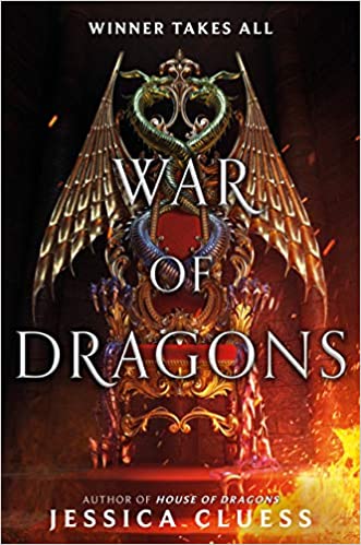
So books with snakes on did really well last year. So add a few of them. Uh… most books were about some sort of king so how about a throne/?Oh and fire, yeah lets burn shit. It’s got Dragon in the title? Add some wings. Bitches love wings.
Final thoughts. Apparently covers bother me far more than I realised. Although the saying “Never judge a book by its cover” should hold true; it is the cover that attracts you to the book in the first place so there you go.
Let me know if you agree with my choices or violently disagree.

Fascinating! I agree absolutely about most of them, in partic the doctor’s leaflet and two faces silhouette, and the Crown Of Bitter Stuff All Jumbled Together!!! I like All Rights Reserved, though, not madly – it’s a bit dry.
Most interesting that Emily Barr has gone into post apoc – I loved her contemporary fiction, read all her earlier books, but tailed off after a couple that felt like she’d only written them because she was under contract to do so. I shall investigate!
Thank you. I think I loved All Rights Reserved so much because I had recently been reading about Disney’s attempts at keeping things out of the public domain and the book just resonated with those ideas. I’m not a huge fan of contemporary fiction so I don’t think I’ve read any Emily Barr before but I am always willing to give post apoc a chance. Let me know what you think once you’ve read it. Thanks for the comment.
[…] been really mean and done “covers that could do better“, I thought I’d attempt to be nice (which is very difficult for me) and do a pretty […]
[…] Butterface Book Tag […]